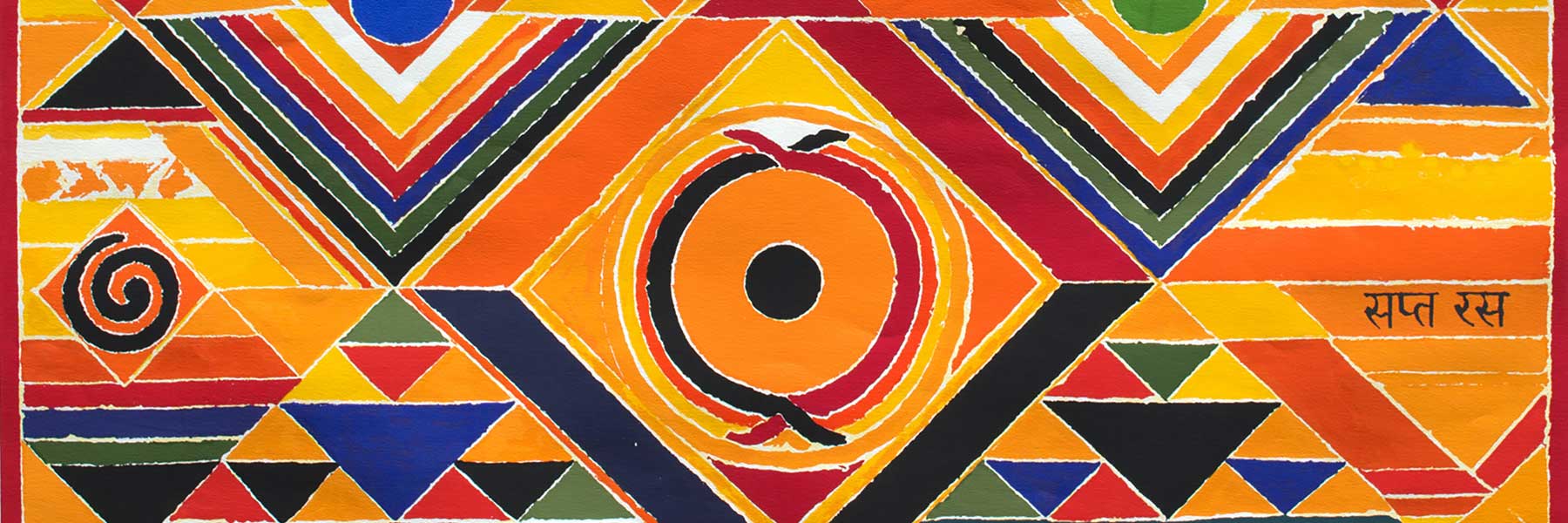
THE BINDU SERIES: THE COMPLEX GEOMETRY OF S.H. RAZA
The works of Indian Modernist artist S.H. Raza have been widely appreciated for their bold colors and profound symbolism that is deeply rooted in Indian culture. The ‘Bindu’ specifically has been something I have been particularly drawn to in Raza’s prints, and I found that the more I learned about his thoughts behind his signature motif, the more I wanted to know.
So, we reached out to Sandhya Bordewekar, a leading art writer and historian, for her point of view. She is an independent curator and has written extensively on contemporary Indian art for national and international media over the last three decades.
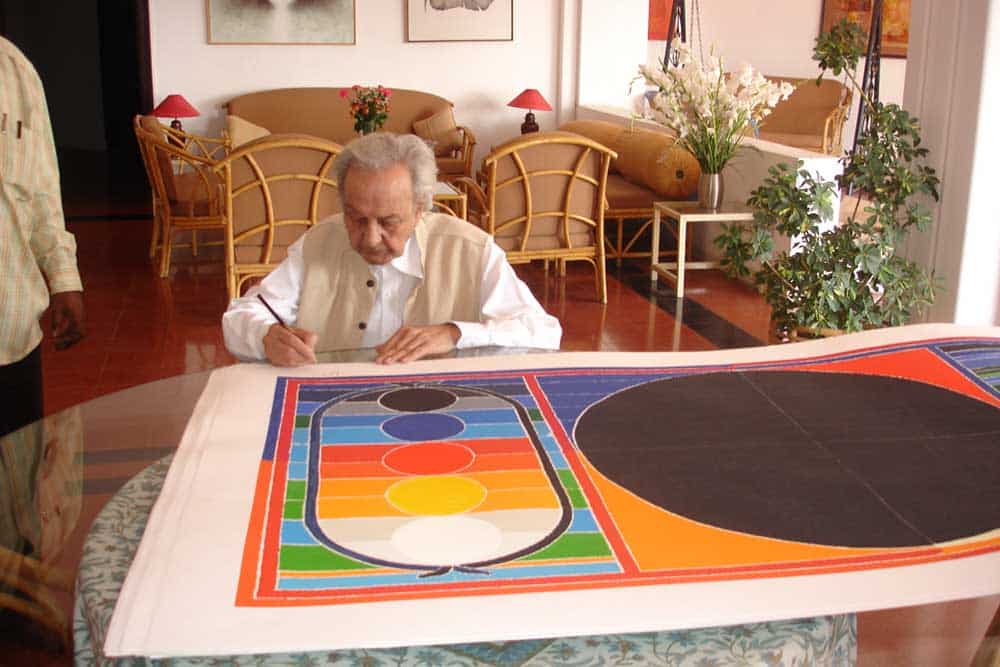
The Complex Geometry Of S.H. Raza
by Sandhya Bordewekar
There is a story, probably apocryphal, that when the young Sayed Haider Raza was an inattentive boy in school, his exasperated teacher drew a large dot on the blackboard and asked Raza to concentrate on it to stop his mind from wandering about! That’s where his fascination with the Bindu apparently came from. However, it was not until 1980 that the Bindu actually made its way from the blackboard to the canvas and forever established itself as a Raza signature.
Raza formally studied art at the J.J. School of Art, Mumbai from 1943 to 1947, and afterwards he was an active part of the Progressive Artists’ Group formed post-Independence that tried to explore a more international visual language for contemporary Indian art. In 1950, he traveled to France on a scholarship, married a French artist and made the country his home. His original love for the lush forests of his childhood, expressed in his early soft watercolor landscapes, was carried on in his depictions of the picturesque French countryside that populated his paintings. These works show a Cubist influence that, according to Raza, brought “a sense of order and proportion in form and structure in his work.”1
In 1959, Raza visited India for an exhibition, and it roused his curiosity about his Indian heritage. Perhaps by then the romance with European art styles had waned, and he was looking for a visual language that came organically to the person he was and his ancestry. He began to move away from the Cubist style and figurative forms and started experimenting with evocative gestural strokes, colorful and with a strong emotional appeal. The gestural strokes slowly came together as geometric abstraction, brightened by his fabulously deft use of colors and control of basic drawing.
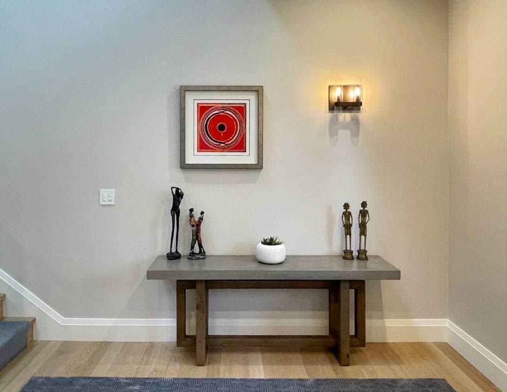
At this critical time, it was the Bindu that emerged from Raza’s growing restlessness with his own work and a deep desire to find new directions. It represented the seed, a natural symbol of fertility, the cyclical nature of the seasons, the circle of life and death that cannot be broken. Spiritually, it signified a powerful source or seat of energy and creation, a point of meditation. Raza has himself described the Bindu as a “…visible form containing all the essential requisites of line, tone, color, texture and space.”2
In fact, the Bindu is believed to have been an artistic ‘re-birth’ for Raza. His interest began to extend into a deeper study of Indian philosophy, of abstract concepts of time, sound and space, and the challenge of depicting them on canvas. This led to the appearance of Tribhuj, or the triangle, signifying the male and female energies (prakriti-purusha), the inverted triangle symbolic of the womb and the upward triangle that of germination of the seed. His paintings became a complex play of metaphysical landscapes that saw geometric forms of the circle, triangle and line bursting forth with color, tracing vivid patterns across paper and canvas.
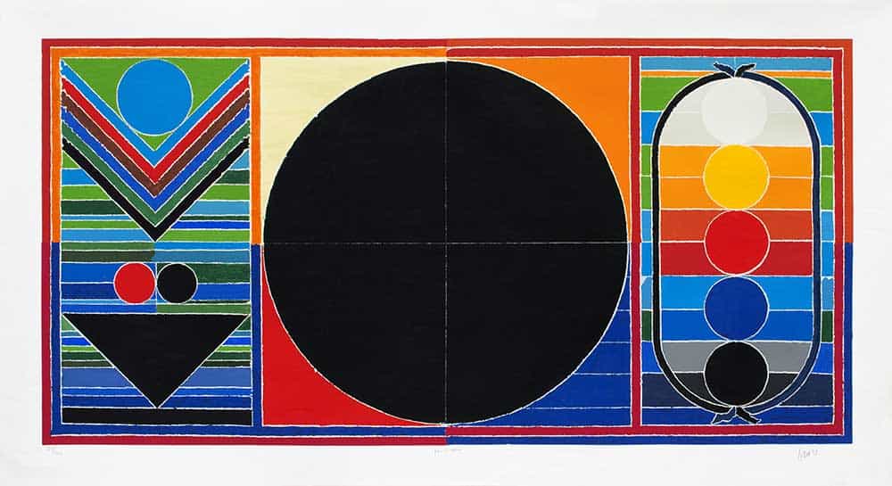
Let us look at three of his very popular fine art prints that encompass most of the stylistic features of art by S.H. Raza as it developed and matured. Panchatatva is a three-part work dominated by the black powerful Bindu as the energy center, flanked by the elements of Prakriti (the inverted triangle, signifying germination and fertility) and Purusha (the elongated oval with the five colored Bindus) on either sides. It is interesting to see that the subject of the work — the Panchtatva, or the five natural life elements of Bhoomi (earth), Vayu (air), Jal (water), Agni (fire) and Akasha (ether, sky) — is represented by thick and thin lines of colors that basically make up Raza’s color palette — black, red, blue, yellow and white.
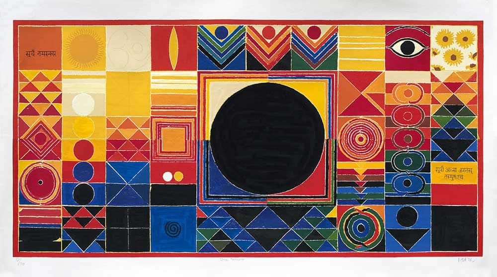
Surya Namaskar is Raza’s salutation to the Sun God, symbolized by a complex interplay of abstract imagery that progresses from the dark overtones at the bottom that get lighter and brighter as they rise to the top, much like the rising sun brightening up the world. In which case, you might wonder why has Raza painted the Sun Bindu such a dark black? Because black also stands for the life-giving oneness of the Sun!
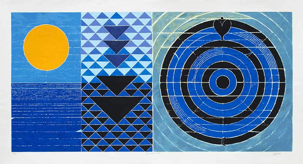
In Surya and Naga, Raza takes the symbolism of the Bindu further, coiling it in the form of a black-blue Naga — the serpent, another metaphor for fertility and sexuality. The Sun here is a bright, blazing yellow Bindu, contrasted with the cooling fluid blue of water, symbolic of the feminine element. But both are life-nurturing, speaking of rejuvenation, re-birth and the continual cycle of life.
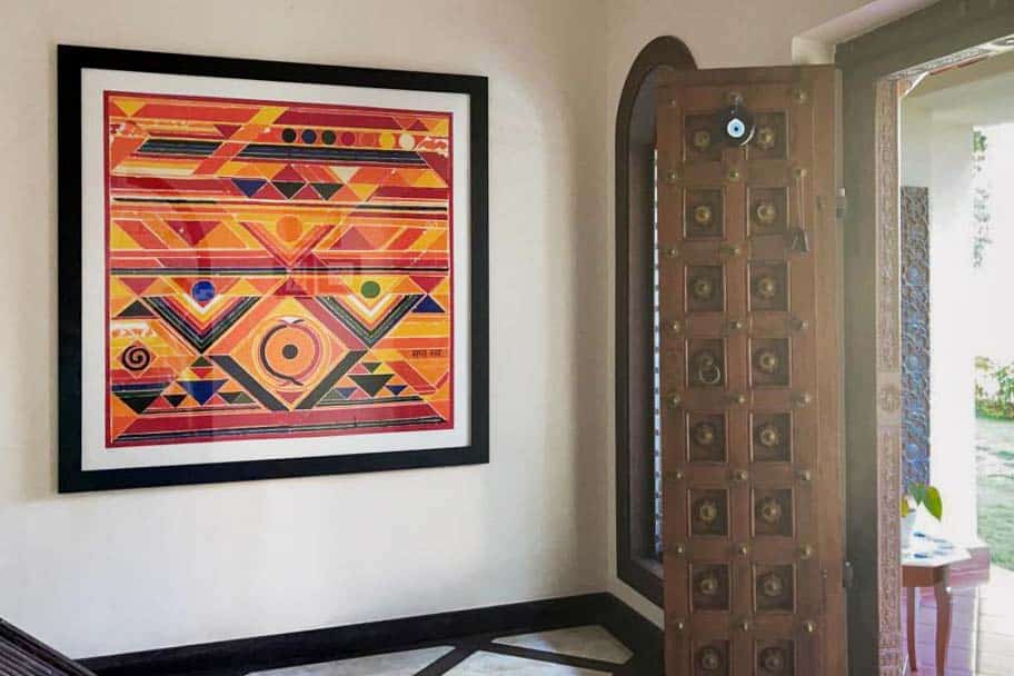
Raza has said, “My work is my own inner experience and involvement with the mysteries of nature and form which is expressed in color, line, space and light.” In the last two decades of his life, when he returned to India forever, his world revolved around exploring their infinite nuances in his studio.
References:
1. Artist quoted in Geeti Sen’s, Bindu: Space and Time in Raza’s Vision, New Delhi: Media Transasia Ltd., 1997, p. 57
2. Ibid. p. 134

Leave a Reply
You must be logged in to post a comment.